


Encapsulating the feelings of mindfulness and peace with Namo Monk
Namo Monk aims to bring mindfulness and inner peace to everyday life and inspire every individual to be their own monk.
The brand tends to push the boundaries of imagination with its modern mix of fragrances that are unique in their own way while devoting completely towards being ethnic, organic and natural. To put it simply it’s a pendulum between nostalgia and exploration.
The brand tends to push the boundaries of imagination with its modern mix of fragrances that are unique in their own way while devoting completely towards being ethnic, organic and natural. To put it simply it’s a pendulum between nostalgia and exploration.


Visual System
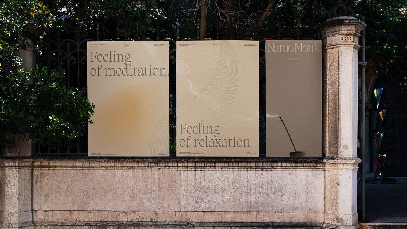
To create a landscape for the brand which instantaneously communicates the feeling of relaxation and peace, we developed a design system which is inspired by the smoke of incense. The design system is very subtle and delicate to encompass the visually satisfying feeling one gets while looking at the soothing and relaxing smoke from incense.


Packaging Design
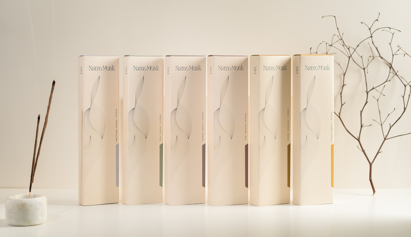
The packaging design created resonates with the core values of being at peace and mindfulness. To express the brand’s premium positioning and narrative a minimalistic backdrop, subtle design system and hints of colour swatches create a distinction between variants is used.


Typography and Colours
To seamlessly align and complement the smooth and subtle design system, Migra Light with elegant glyphs and delicate edges is selected as the primary font. For the secondary font, the Archivo family has been selected. Its simple yet contemporary style assists in getting brand communications across with ease.
“Nature always wears the colours of the spirit” - Ralph Waldo Emerson. We borrowed the colours from Mother Nature to create an immersive at the same time liberating vibe for the brand.


